
Someone clicks an ad because it promises help with a specific problem. They land on a page full of company history, vague benefits and a button that says “Learn More.” The page may look polished, but the visitor still has work to do.
A landing page should make one decision easier. It explains the offer, answers the questions that could stop someone, and provides a clear next step. AI can help draft that page, but it cannot decide what your business can honestly promise.
Write a one-page brief before opening a builder
Identify the visitor, the problem that brought them, the offer and the action you want them to take. Add the campaign message they will see before arriving. These pieces need to agree.
Then list the facts you can support: service area, process, eligibility, what is included and what happens after a request. If a price, turnaround time or result is not approved and current, leave it out. A generated claim is still your claim once you publish it.
Choose one primary action, such as requesting an assessment or booking a consultation. You can repeat that action lower on the page. Keep necessary navigation, contact information and privacy links available; simplicity should not trap the visitor.
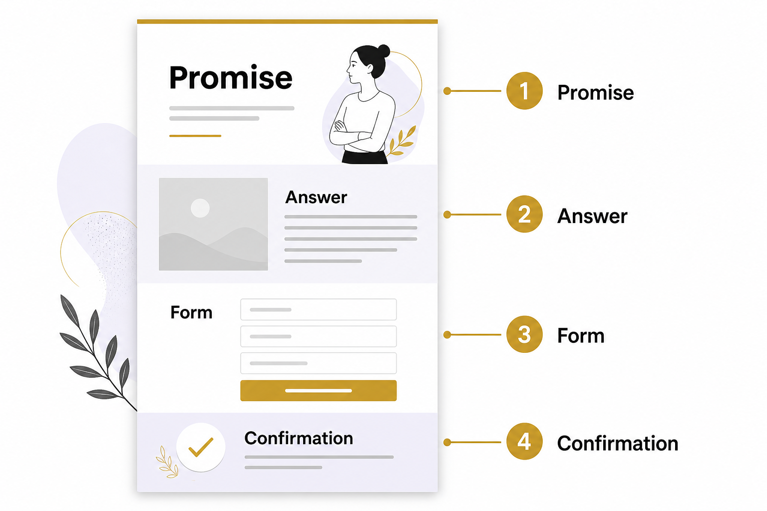
Arrange the page in the order a buyer thinks
Start with a headline that names the offer and its relevance. Follow it with a short explanation of who it helps. A person should not have to decode a slogan before knowing whether they are in the right place.
Next, explain the problem and your approach. Use a real product image, an actual process diagram or a relevant demonstration. A decorative image does little if the visitor needs to understand what happens during an appointment.
- Offer: What is the person requesting or buying?
- Fit: Who is it for, and what important limits apply?
- Proof: What authentic evidence supports confidence?
- Process: What happens before and after the action?
- Questions: What would a cautious buyer ask?
- Action: What exactly should the person do next?
Use testimonials only when they are authentic and you have appropriate permission. Do not generate customer portraits, quotes or before-and-after results and present them as real evidence.
Use AI as a page editor
Give an approved assistant your factual brief and ask for several headlines, a proposed section order and a list of unanswered questions. Require it to use only supplied facts. Ask it to flag missing evidence instead of inventing proof.
A useful second pass is a skeptical-reader review: “What would stop someone from understanding this offer or completing this form?” Treat the answer as a checklist to investigate. The assistant has not interviewed your visitors and cannot know which objection is most important.
Keep a person responsible for the final copy. Read it aloud. Remove claims your business cannot defend, artificial urgency and sentences that sound impressive without explaining anything. If generated visuals could be mistaken for real work, replace them or label them clearly.
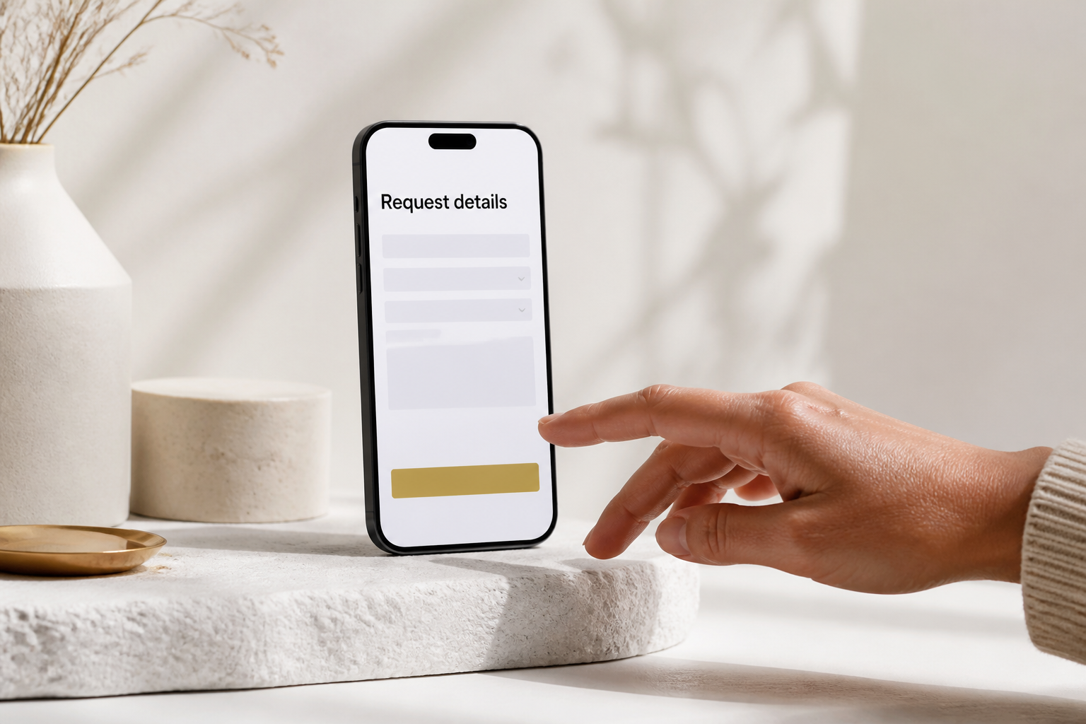
Make the form usable on a phone
Ask only for information needed to handle the request. Every required field needs a purpose. Explain why you need sensitive or unusual information, and avoid collecting it when a later conversation would be safer.
Use visible labels, clear instructions and understandable error messages. W3C’s form guidance emphasizes these elements because they help people navigate and complete forms. W3C: Forms tutorial
Test keyboard navigation, focus visibility, text contrast and zoom. Check that a consent banner does not cover the action. Ensure the form explains success after submission and that the inquiry reaches the right destination. A beautiful form that loses messages is a broken business process.
A hypothetical example
A cleaning company runs an ad for recurring office cleaning. Its page initially asks visitors to select from every service it offers. A better draft describes the office-cleaning process, service area and information needed for an estimate. It asks for business contact details and property basics, then confirms the request.
AI could help compare the ad with the page and identify the mismatch. The owner still verifies which buildings the company serves and which questions are necessary for a useful estimate.
Measure completed actions and lead quality
Record successful submissions separately from button clicks. GA4 can mark relevant events as key events, but your sales records must still establish which inquiries qualify. Google Analytics: Key events
Compare the visitor source, completed actions and later outcomes. If traffic is low, do not pretend a tiny headline test proves a universal winner. Start with clear usability problems and customer feedback. When volume supports testing, change one meaningful element, define success in advance and allow enough time to interpret the outcome.
For help connecting your offer, landing page and follow-up process, schedule an Eastmoor Digital discovery call.
Sources & further reading
Primary references checked for this refresh. Availability and platform behavior may change.
- W3C: Forms tutorialChecked 2026-08-31
- Google Analytics: Key eventsChecked 2026-08-31